

Key Takeaways
Skin Undertone
Your skin undertone is the subtle hue that lies beneath your surface complexion - separate from how light or dark your skin is. It doesn't change with a tan or seasonal shifts, unlike your surface tone. Undertones are generally grouped into three categories: warm (yellow, peachy, or golden), cool (pink, red, or bluish), and neutral (a mix of both).
Undertone is determined largely by the ratio and distribution of melanin, hemoglobin, and carotenoid pigments in the skin's deeper layers - which is why it remains stable even as surface color shifts with sun exposure.
The Real Reason Foundation Looks Wrong
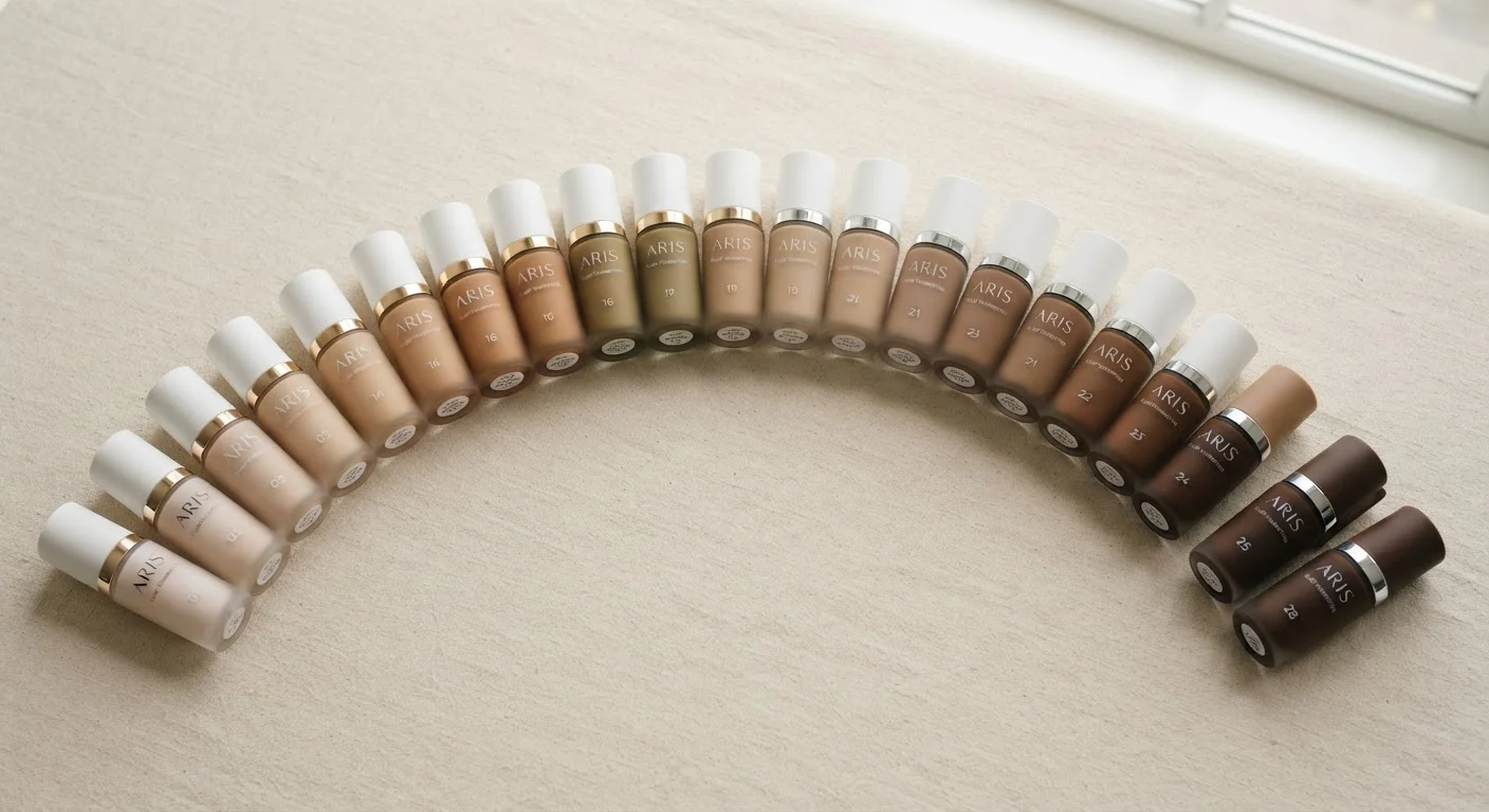
Most people troubleshoot foundation by adjusting depth - going a shade lighter or darker - and then wonder why the mismatch persists. The missing variable is almost always undertone. Foundation that's the right depth but the wrong undertone will look orange, ashy, or artificially pink no matter how precisely you matched the swatch in-store.
Undertone operates independently of how light or dark your skin is. A person with a deep complexion can have cool undertones; someone fair-skinned can run warm. This is why grabbing a shade that "looks close" on the back of a hand isn't a reliable method - and why understanding your own undertone category transforms how you shop for makeup and color.
Choosing the right foundation finish is the next puzzle after undertone - but getting undertone right first makes every other foundation decision easier.
3
Undertone categories: warm, cool, neutral
Cosmetic science and makeup formulation broadly groups skin undertones into these three categories, each reflecting the dominant hue beneath the skin's surface.
~60%
Foundation returns attributed to color mismatch
Industry research from cosmetic retail has indicated that color mismatch - often driven by undetected undertone differences - is among the most common reasons consumers return or exchange foundation products.
How to Identify Your Undertone
No single test is definitive, but three quick checks used together give a reliable answer:
- Vein check: Look at the veins on your inner wrist in natural light. Greenish veins tend to indicate warm undertones (the yellow in your skin mixes with blue to read green). Bluish or purple veins suggest cool undertones. If you see both or can't decide, you're likely neutral.
- Jewelry test: Notice whether gold or silver jewelry tends to look more natural against your skin. Gold flatters warm undertones; silver flatters cool. If both look equally good, neutral is a strong possibility.
- White paper test: Hold a plain white sheet next to your bare face in daylight. A yellowish or golden cast by comparison points to warm; a pinkish or bluish cast points to cool.
These tests work because they isolate the underlying hue rather than the surface depth. Running all three and looking for patterns gives you a much clearer answer than any one method alone.
Test Foundation in Natural Light, Not Store Lighting
Retail lighting - especially the warm or fluorescent kind common in stores - can mask undertone mismatches. Always step outside or near a window before deciding whether a shade works. If the shade disappears into your jawline in daylight, it's a real match.
Warm, Cool, and Neutral: What Each Category Means
Warm undertones carry yellow, peachy, or golden hues. People with warm undertones often find that earthy shades - terracotta, olive, mustard, warm browns - look natural and grounded against their skin, while stark cool tones can look harsh.
Cool undertones have pink, rosy, or bluish qualities beneath the surface. Jewel tones (sapphire, emerald, ruby), icy pastels, and true whites typically complement cool undertones, while very warm or orange-adjacent shades can clash.
Neutral undertones are a balanced mix, with no dominant warm or cool quality. Neutral-undertoned people have more flexibility - they can work with both warm and cool palettes, though very extreme versions of either (bright orange, icy lavender) may still read as mismatched.
Understanding where you fall also informs clothing choices well beyond makeup. Color is one of three core levers in building a personal aesthetic - knowing your undertone gives you a grounded place to start with it.
Applying Undertone Knowledge Practically
Once you know your undertone, shopping for foundation becomes more efficient. Most foundation lines code their shades by undertone using letter suffixes - 'W' or 'Y' for warm, 'C' or 'P' for cool, 'N' for neutral. Filter by undertone first, then narrow by depth. This cuts the swatch field significantly before you even try a product on your skin.
When swatching, apply the shade to your jawline (not your hand) and check it in natural light after a few minutes - some formulas oxidize slightly as they set. A correct undertone match will disappear into your skin; a mismatch will create a visible line between your face and neck.
Undertone knowledge extends to concealer, blush, and bronzer as well. Cool-undertoned skin often benefits from pink- or berry-based blushes rather than warm peach. Warm-undertoned skin can lean into golden or terracotta bronzers without looking muddy.
If you're new to building a makeup routine from scratch, a beginner's guide to everyday makeup can help you put these concepts into a practical, low-pressure context.
Undertone Terms Vary by Brand
Not every cosmetics line uses the same letter coding. Some use descriptive words like 'golden,' 'rosy,' or 'beige'; others use numbers that denote undertone on a warm-to-cool spectrum. If a brand's coding isn't immediately clear, look for online shade guides or ask a trained counter staff member to explain their specific system before swatching.